
I joined Sunrise Calendar as the 2nd employee in 2013, with the idea to build a better calendar app on iOS, Android, and web. As a software engineer working on the iOS app, I was able to design, prototype, build, and iterate on features on my own.
In 2015, Microsoft acquired the company for $100M. At the same time, they also acquired Acompli, a popular email app on iOS and Android. A few months later, the two apps were merged to become Outlook Mobile.


At the time, the challenges were twofold:
Create a native mobile-first app of an historically complex app on desktop, for a much wider audience, while respecting the platforms and their guidelines.
Integrate with Microsoft culturally, while helping them transition their software building culture from a Windows-centric world to an agile multi-platform one.
In 2015, Outlook only existed on desktop and web. Our first challenge was to merge our acquired apps into a new product that belonged to the Microsoft ecosystem. From there, we talked to users, and iterated to create the best mobile email experience. With success, came a lot of requests to integrate with us, which we also had to adapt to.
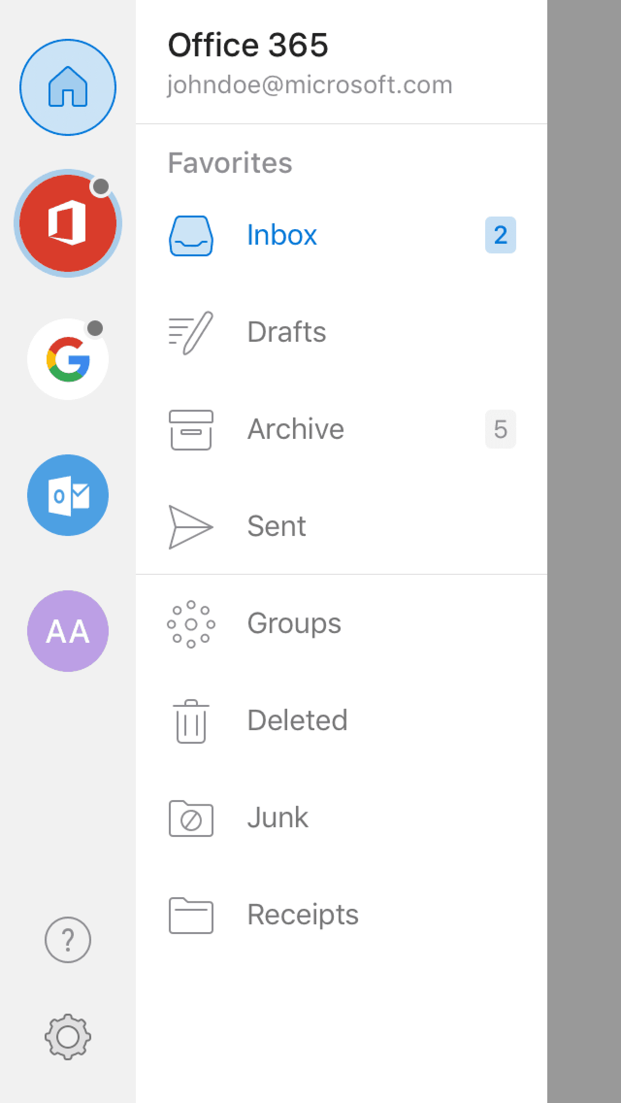
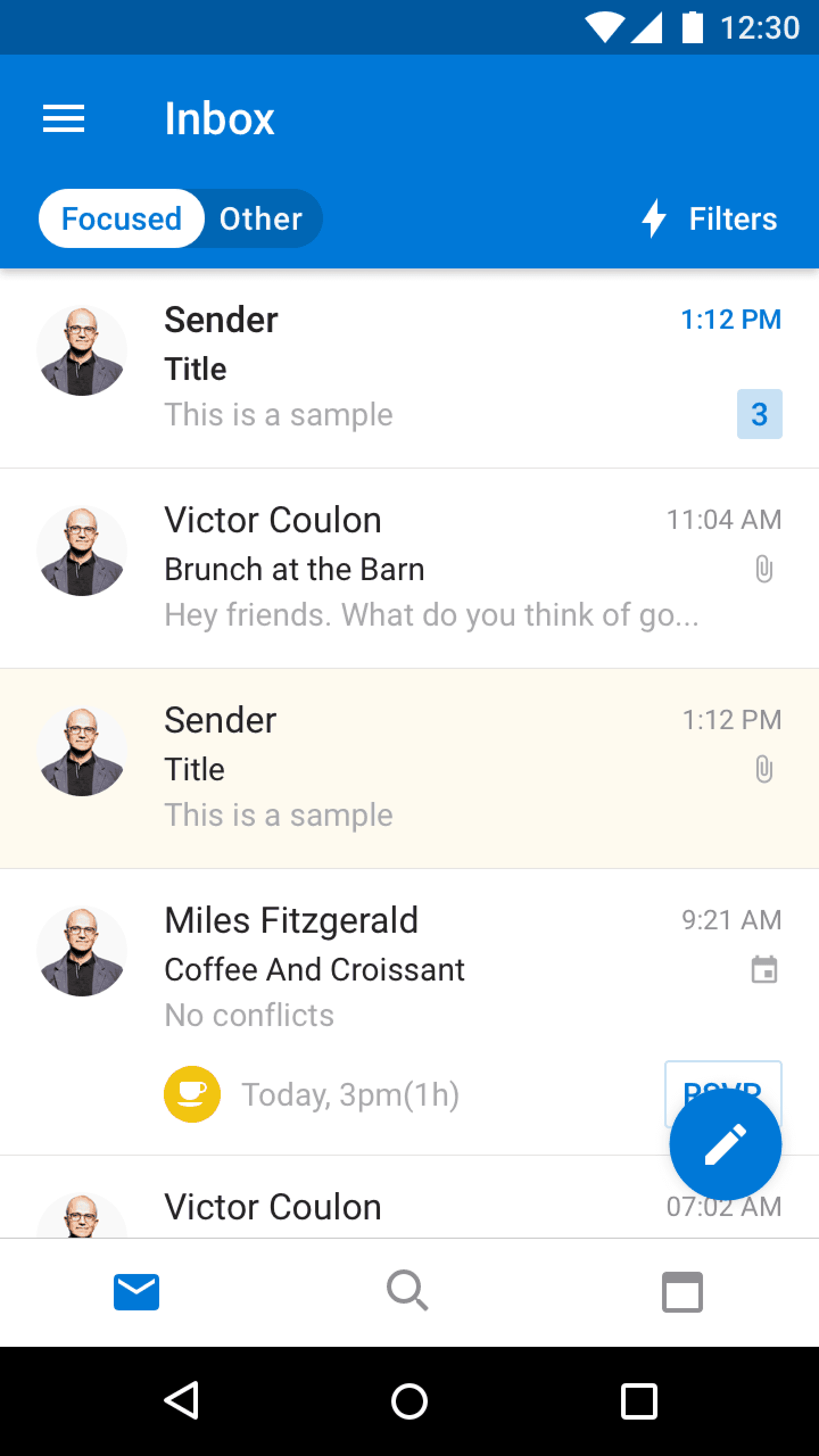
While both iOS and Android had their stock calendar and email apps, we took the strategic direction to keep Outlook a single app, because that's what people were used to, and because downloading one app is easier than two.
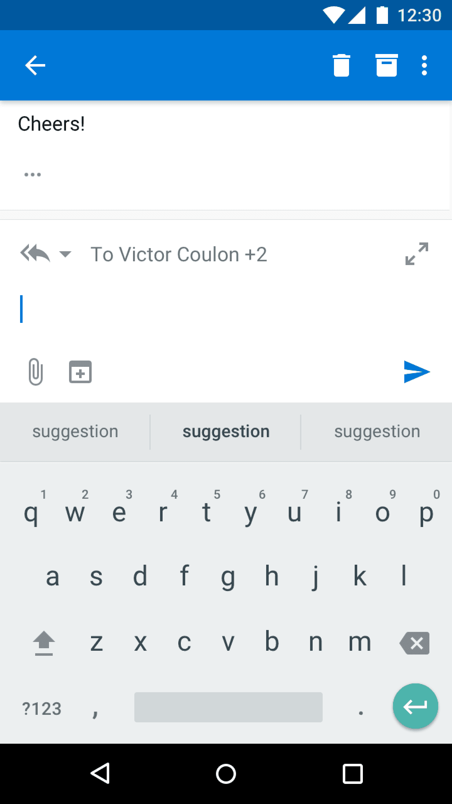
We started by adapting the navigation of the Acompli app to focus it on the most used features: email and calendar. We also developed a mobile design language that reflected Microsoft's identity while ensuring that users felt at home on their iOS or Android devices.

Early in the adventure, our user research team embarked on a six-month trip to ask various people around the world how they felt about using an email and calendar app on mobile. What we learnt is that fewer and fewer people wanted to use them. In China for example, most tasks historically accomplished in these apps now happened in WeChat.
We also learnt that only 20% of users were inbox zero, which revealed a bias in our team.
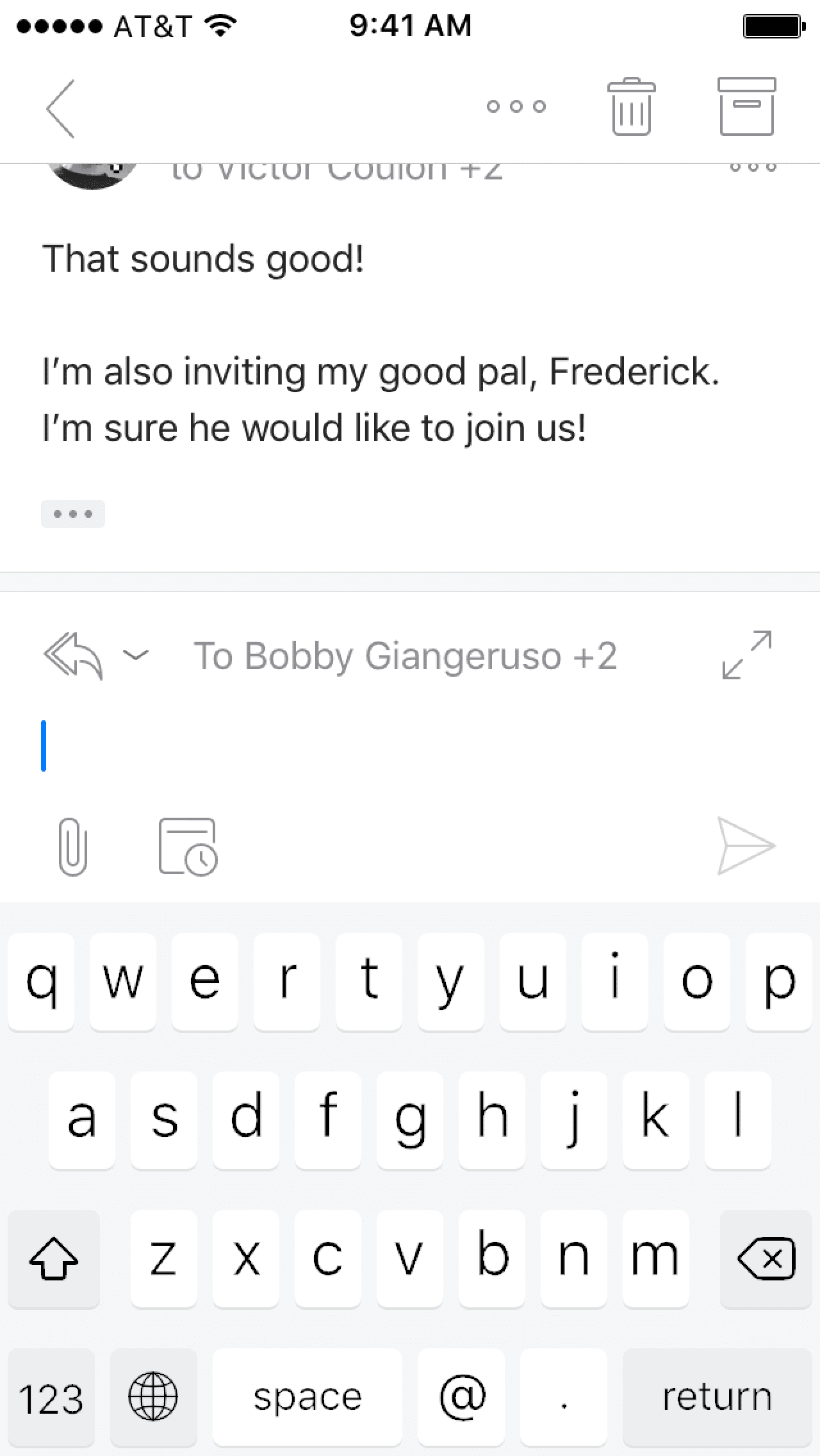
Based on these learnings, we decided to make our app feel more chat-like, without losing what makes email powerful: group emails by conversation, optimize for long reads, keep email as the universal standard for digital communication.
We redesigned the email views, including the reply box, shipped it to a beta train (still thousands of users), and quickly had to iterate following feedback. We also improved the sidebar to make multiple inboxes easier to navigate. And Design initiated a change to auto-detect the email provider in the onboarding, a huge point of friction.

Because of its popularity, it was decided in 2017 that Outlook Mobile would become a hub for people to experience Microsoft apps on Mobile. Advantage: suddenly a lot of features that didn't make sense as standalone apps (e.g. Office Lens) wanted to integrate with us. Drawback: the same thing.
We had to spend a lot of time to convince other teams to adapt to the platform when designing, and create our own guidelines of what it meant to integrate in our app. We also had to be the guardians of the experience, to keep the experience simple and intuitive.
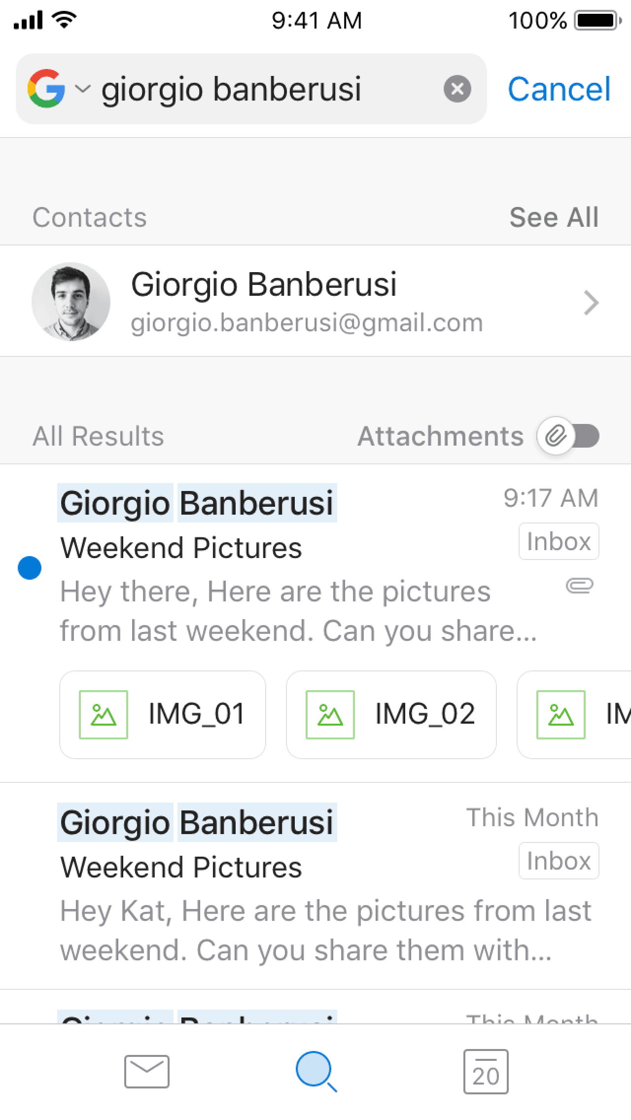
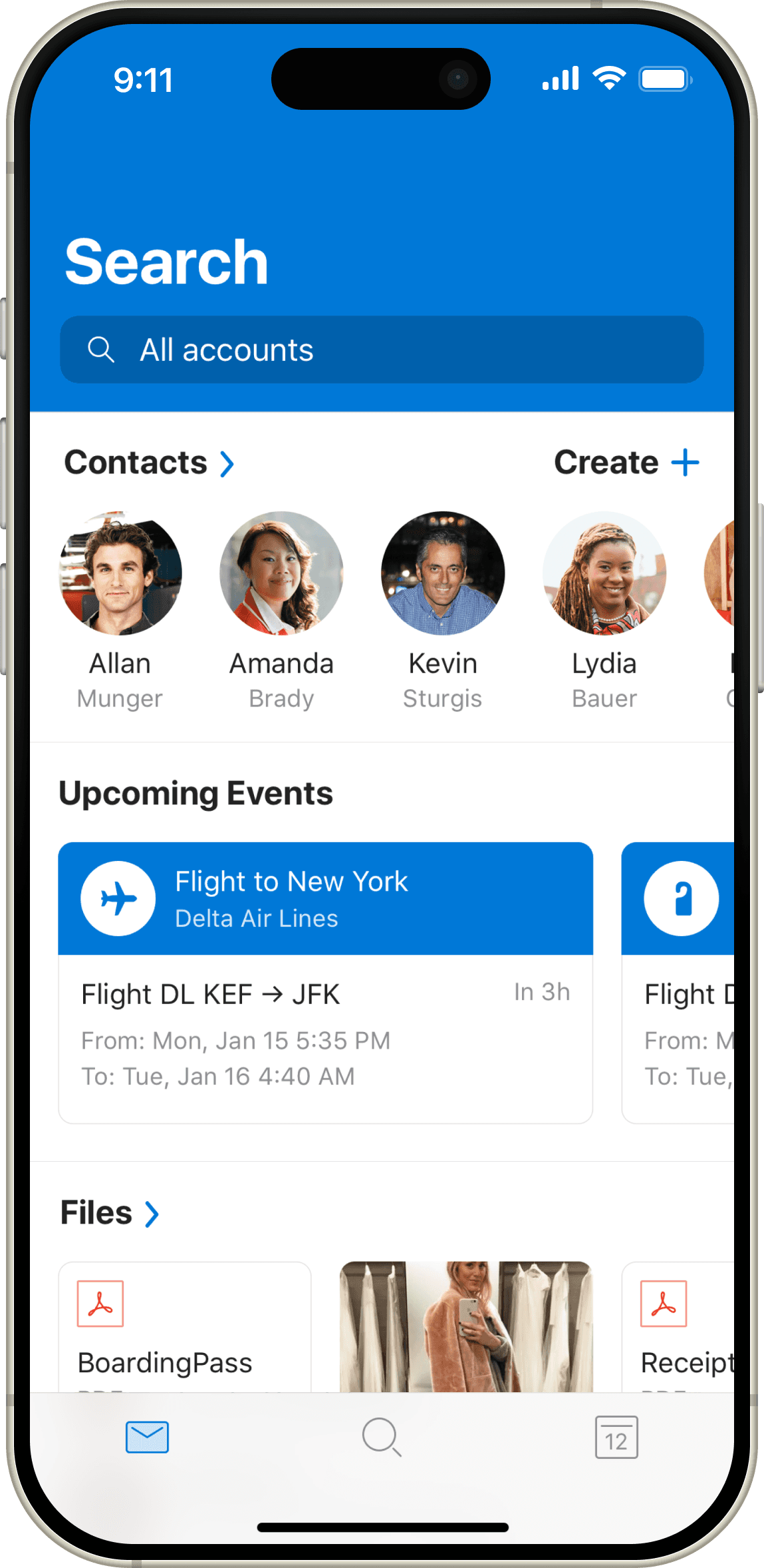
We integrated with LinkedIn, added a better search into our app, and made it a destination to surface multiple types of information: events, emails, files, etc. It also gave us a way to resurface files and contacts that were made less visible in the new navigation.


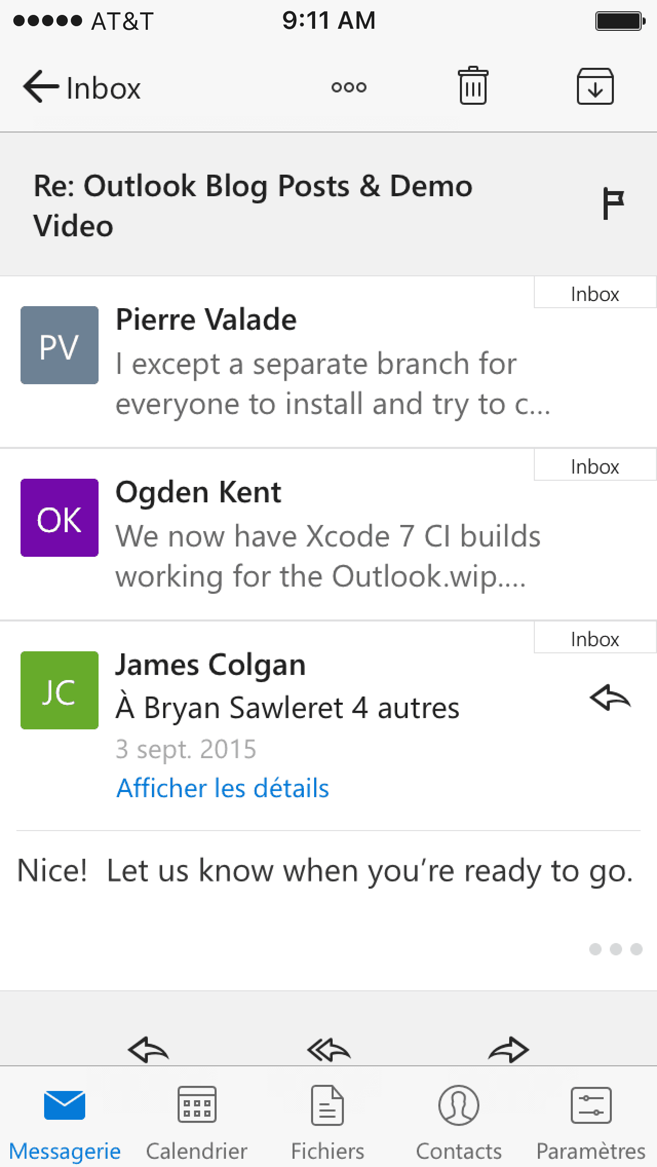
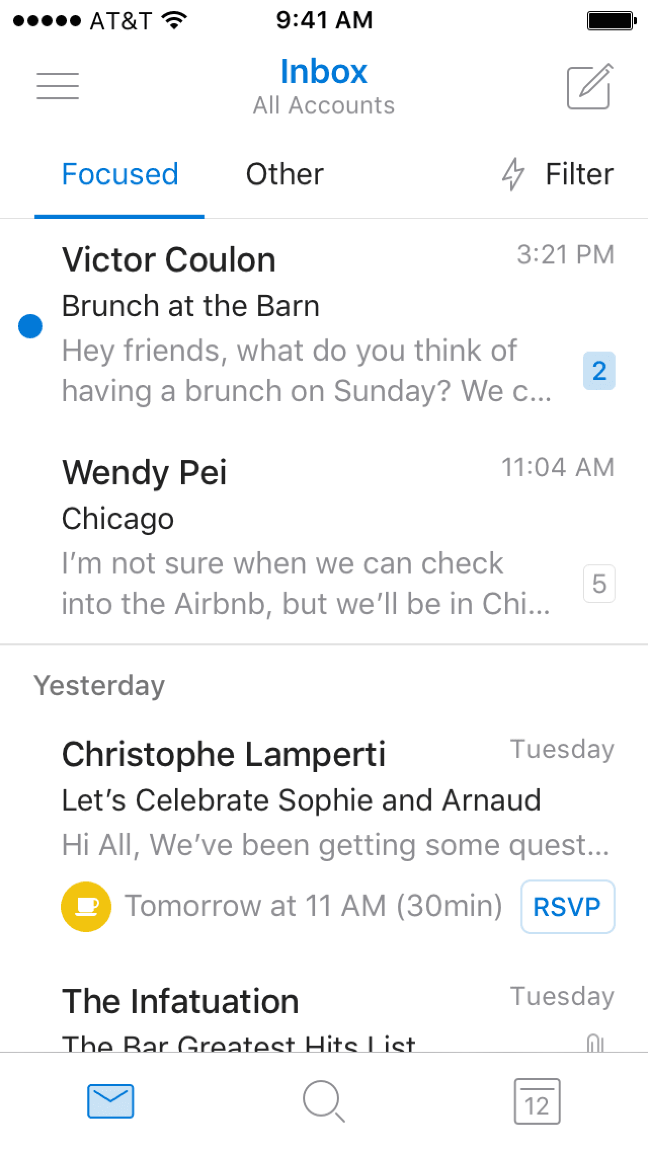
With the release of the iPhone X and iOS 11, we made our app more distinct visually (we adopted a blue header), leading the way to create a coherent Outlook identity across platforms. We also came up with the Focused / Other visual switch for this signature feature that come from Acompli. It eventually became a branded element across all Microsoft apps.
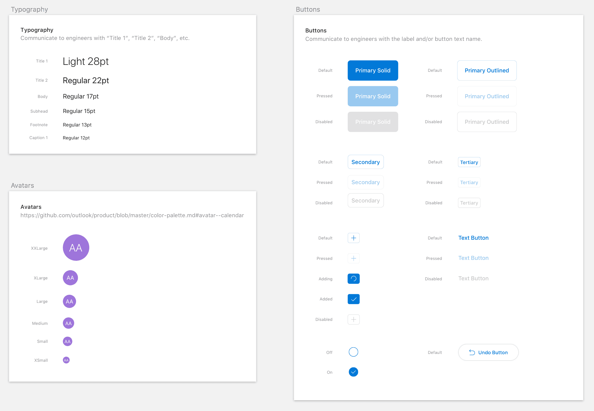
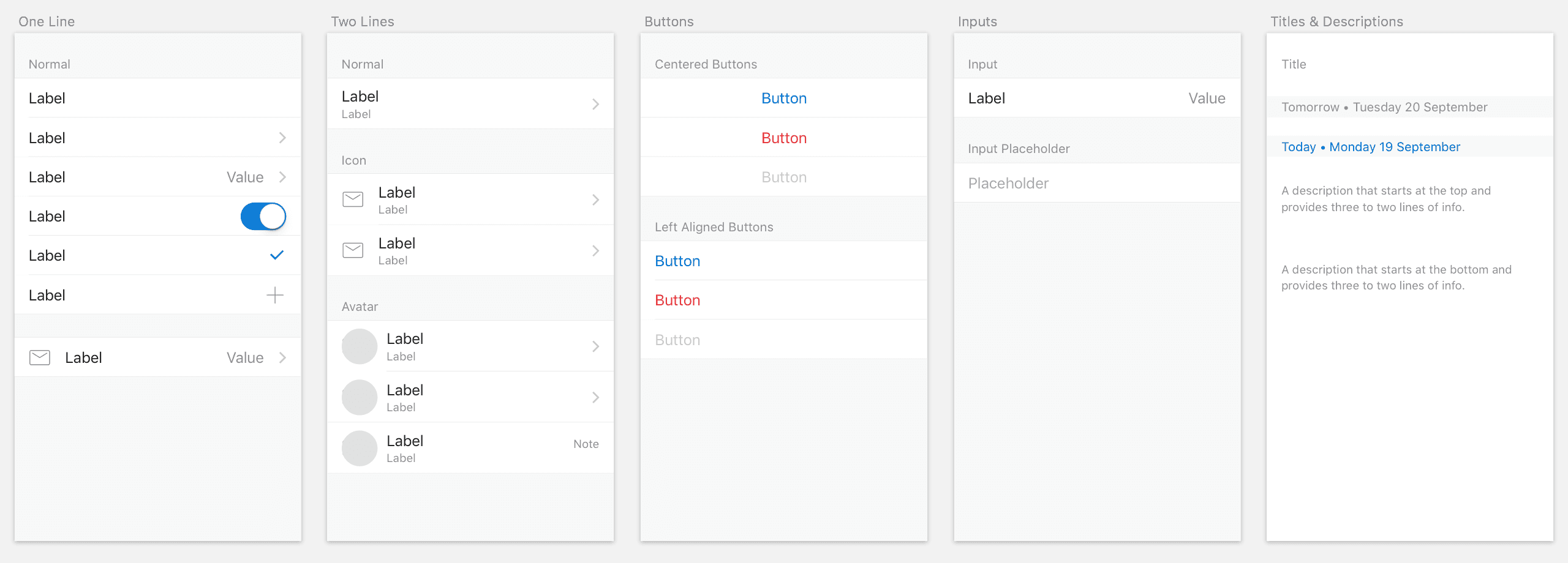
Coming from a mobile-centric world, we all used Sketch, and worked in design sprints. As we scaled Outlook Mobile, streamlining work between engineers, designers, and product managers became a necessity. So we invested significant energy into building and maintaining a UI kit for iOS and Android. This also gave us a concrete tool to convince other teams to build a coherent app identity between mobile, desktop and web, while respecting the specificities and expectations of users on each platform.
Looking back, I think our biggest accomplishment is to have created a team culture where product, engineering, and design had an equal voice in the development process, and where designers were brought in as early as possible. It took a lot of determination and patience to show that this way of working brought results. It became easier when other teams saw the speed at which we released features, and the love from users.
Strategically, we wanted people to feel something about the app. Why do people love it? Why do people dislike it? How do we increase the former and reduce the latter? We always saw it as a better problem than having a majority of users not care about the app.
When I left, we had 100M+ monthly users, and were rated 4.8 stars in the iOS App Store.